
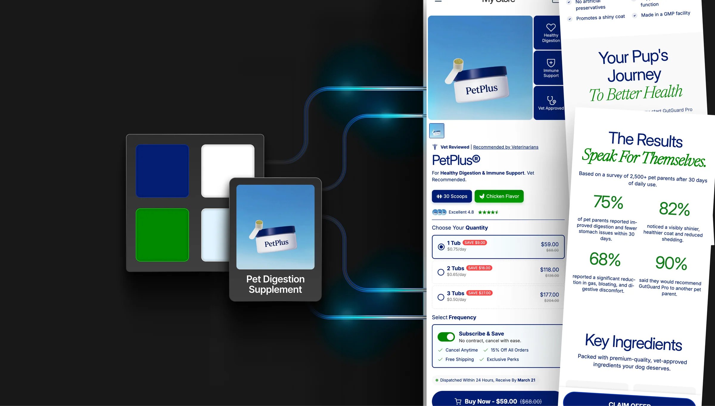
Colors
Go to Theme settings → Colors. Elixir runs on a brand palette of four swatches that feed the whole store. Set them once and your buttons, badges, accent text, and links all follow. There are no separate color schemes to manage.Brand colors
There’s no background swatch. Sections are white by default. Change a background on the section itself using its Section background setting.
Accent text gradient
Below the palette is a single Accent Text Gradient used everywhere gradient text appears (headings, review highlights, benefit titles, guarantee text). It defaults tolinear-gradient(45deg, Primary, Accent), so it tracks your palette automatically. Change the Primary or Accent swatch and every gradient headline updates. Edit the gradient directly if you want a different angle or colors.
Sections that support it have a Use accent gradient toggle; turn it on to apply the gradient to that section’s highlighted words.
How the palette reaches your sections
- Section color settings start on a palette color. For example, a section’s accent text color starts as your Primary. Change the swatch and everything still on its default follows.
- Manually changing a color pins it. Once you set a color on a section, that section keeps your value and stops following the palette. To reconnect it, paste the palette hex back in.
- Sections added from a template or preset ship with their own colors and won’t follow the palette until you set them to your brand colors.
- Sections with a “Use theme colors” toggle. On means the section follows your palette. Off reveals the section’s own background, text, accent, and button color settings.
Header and footer colors
Header and footer colors live on those sections, not in theme settings:
Most of these default to a palette color, so they follow your brand until you override them.
Typography
Go to Theme settings → Typography. Elixir supports three independent font families:
Font weight is set by the font picker itself. Pick the weight you want when choosing each font.
Key settings
- Letter spacing. Tighten or loosen character spacing, separately for headings, body, and accent text
- Heading text transform. Set all headings to uppercase, lowercase, or capitalize
- Accent advanced settings. Turn on to add text transform and italic style for the accent font
- Custom font sizes. Enable Custom typography to set exact pixel sizes for H1, H2, H3, body, and subtitle text
Buttons
Go to Theme settings → Button Styling. Elixir has a global button system. Style your buttons once and it applies everywhere. Sections can override the global style if needed.Style options
- Corner radius. 0px (square) to 40px (pill-shaped), with an option to apply it to every button element or just primary buttons
- Font size and letter spacing
- Vertical padding. Controls button height
- Text transform. Uppercase, capitalize, and so on
- Border width. Outline thickness on buttons
Colors and effects
- Button color comes from your palette. Buttons fill with your Primary brand color and use white labels. Change the Primary swatch to restyle every button at once. Individual sections can still override their own button colors.
- 3D effect. Adds a bottom border to create a raised/3D look
- Box shadow. Adds depth with adjustable intensity (1–5)
- Gradient buttons. Replace the solid fill with a gradient: start/end colors, direction, separate hover colors, and an optional shine animation
- Navigation and carousel buttons. Turn on global nav button styling so slider arrows inherit the same radius, border, and shadow