> ## Documentation Index
> Fetch the complete documentation index at: https://docs.ecomelixir.com/llms.txt
> Use this file to discover all available pages before exploring further.
# Sections & blocks
> Overview of all available sections and blocks in Elixir
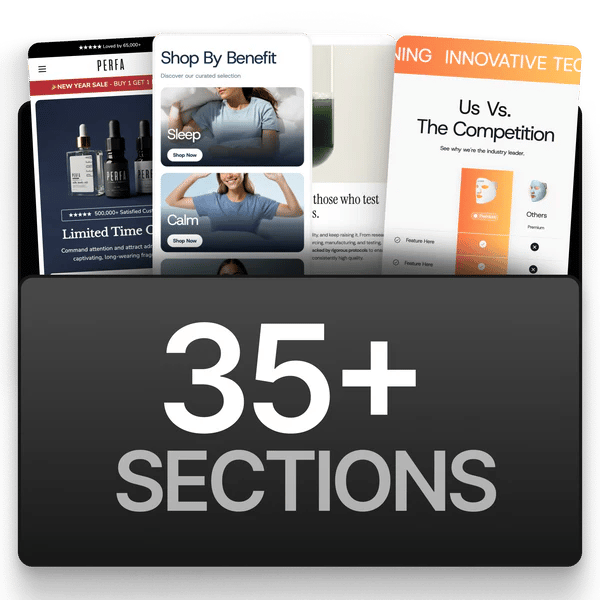 Elixir includes **60+ sections** you can add to any page from the Shopify theme editor. Click **Add section** in the left sidebar to browse and add them.
Section names below are the names you'll see in the editor.
## Hero & banners
| Section | Description |
| ----------------------- | -------------------------------------------------------------------------------- |
| **Hero Banner** | Full-featured hero with background image or video, text overlay, and CTA buttons |
| **Image Banner** | Versatile banner with separate desktop and mobile images |
| **Announcement Bar** | Thin bar above the header for promotions |
| **Countdown Banner** | Announcement bar with a countdown timer |
| **Highlight Banner** | Bold promotional banner for sales events |
| **Collection Banner** | Header banner for collection pages |
| **Email Signup Banner** | Banner with an email capture form |
## Social proof & reviews
| Section | Description |
| ---------------------- | ---------------------------------------- |
| **Customer Reviews** | Review grid |
| **Reviews Carousel** | Scrollable review slider |
| **Amazon Reviews** | Reviews styled like Amazon |
| **Facebook Reviews** | Reviews styled as Facebook posts |
| **Facebook Comments** | Comment thread styled like Facebook |
| **Testimonials** | Quote-style testimonial cards |
| **Video Testimonials** | Video-based testimonials |
| **Video Reviews** | Video review carousel |
| **As Seen In Logos** | Logo bar for press mentions and partners |
| **Board of Advisors** | Expert or advisor profiles for authority |
See the [social proof guide](/guides/social-proof) for which one to use, and [product ratings](/guides/product-ratings) for wiring real star ratings to your review app.
## Content & information
| Section | Description |
| -------------------------- | ------------------------------------------------- |
| **Rich Text** | Flexible text content |
| **Image with Text** | Image paired with text |
| **Two Column Content** | Side-by-side layout |
| **Alternating Features** | Features alternating left and right down the page |
| **Content Tabs** | Tabbed content |
| **Steps Results** | Step-by-step process display |
| **Statistics Grid** | Key numbers in a grid |
| **Statistics Column** | Key numbers in a column |
| **Benefits Grid** | Benefits in a grid with icons |
| **Benefits Carousel** | Scrolling benefit highlights |
| **Product Benefits** | Benefit list tied to a product |
| **Roadmap** | Timeline or milestone display |
| **FAQ** | Accordion FAQ |
| **Featured Links** | Link cards to other pages |
| **Scrolling Features Bar** | Auto-scrolling feature strip |
| **Scrolling Ticker** | Marquee text banner |
| **Divider** | Spacer or dividing line |
## Product & collection
| Section | Description |
| ----------------------------- | -------------------------------------------- |
| **Featured Product Details** | Showcase a single product with full details |
| **Product Details (TBs)** | Product page section built from theme blocks |
| **Collection Grid** | Products in a grid |
| **Collection Grid Page** | Full collection page grid |
| **Featured Collections** | Showcase multiple collections |
| **Product Comparison** | Comparison table against competitors |
| **Enhanced Comparison** | Richer comparison layout |
| **Before & After Comparison** | Image comparison slider |
| **Related Products** | Product recommendations |
## Conversion & urgency
| Section | Description |
| -------------------------- | ------------------------- |
| **Sticky Add to Cart** | Fixed buy bar on scroll |
| **Satisfaction Guarantee** | Trust badge and guarantee |
| **Newsletter** | Email signup |
| **Contact Form** | Contact form |
## Visual & gallery
| Section | Description |
| -------------------- | ----------------------------- |
| **Photo Grid** | Grid of images |
| **Image Grid** | Four-image layout |
| **Card Grid** | Four-card layout |
| **Instagram Feed** | Instagram-style photo feed |
| **Scrolling Images** | Auto-scrolling image carousel |
## Landing pages
| Section | Description |
| -------------------- | ---------------------------------------- |
| **Listicle** | Numbered list-style landing page |
| **Long Advertorial** | Long-form editorial landing page |
| **Advertorial V2** | Advertorial layout with a sticky sidebar |
| **Breadcrumb** | Navigation trail |
See the [advertorials guide](/guides/advertorials) for building these.
## Utility
| Section | Description |
| ----------------- | ----------------------------- |
| **Custom Liquid** | Your own HTML, CSS, or Liquid |
| **Apps** | Placement slot for app blocks |
***
## Blocks
Elixir includes **60+ sections** you can add to any page from the Shopify theme editor. Click **Add section** in the left sidebar to browse and add them.
Section names below are the names you'll see in the editor.
## Hero & banners
| Section | Description |
| ----------------------- | -------------------------------------------------------------------------------- |
| **Hero Banner** | Full-featured hero with background image or video, text overlay, and CTA buttons |
| **Image Banner** | Versatile banner with separate desktop and mobile images |
| **Announcement Bar** | Thin bar above the header for promotions |
| **Countdown Banner** | Announcement bar with a countdown timer |
| **Highlight Banner** | Bold promotional banner for sales events |
| **Collection Banner** | Header banner for collection pages |
| **Email Signup Banner** | Banner with an email capture form |
## Social proof & reviews
| Section | Description |
| ---------------------- | ---------------------------------------- |
| **Customer Reviews** | Review grid |
| **Reviews Carousel** | Scrollable review slider |
| **Amazon Reviews** | Reviews styled like Amazon |
| **Facebook Reviews** | Reviews styled as Facebook posts |
| **Facebook Comments** | Comment thread styled like Facebook |
| **Testimonials** | Quote-style testimonial cards |
| **Video Testimonials** | Video-based testimonials |
| **Video Reviews** | Video review carousel |
| **As Seen In Logos** | Logo bar for press mentions and partners |
| **Board of Advisors** | Expert or advisor profiles for authority |
See the [social proof guide](/guides/social-proof) for which one to use, and [product ratings](/guides/product-ratings) for wiring real star ratings to your review app.
## Content & information
| Section | Description |
| -------------------------- | ------------------------------------------------- |
| **Rich Text** | Flexible text content |
| **Image with Text** | Image paired with text |
| **Two Column Content** | Side-by-side layout |
| **Alternating Features** | Features alternating left and right down the page |
| **Content Tabs** | Tabbed content |
| **Steps Results** | Step-by-step process display |
| **Statistics Grid** | Key numbers in a grid |
| **Statistics Column** | Key numbers in a column |
| **Benefits Grid** | Benefits in a grid with icons |
| **Benefits Carousel** | Scrolling benefit highlights |
| **Product Benefits** | Benefit list tied to a product |
| **Roadmap** | Timeline or milestone display |
| **FAQ** | Accordion FAQ |
| **Featured Links** | Link cards to other pages |
| **Scrolling Features Bar** | Auto-scrolling feature strip |
| **Scrolling Ticker** | Marquee text banner |
| **Divider** | Spacer or dividing line |
## Product & collection
| Section | Description |
| ----------------------------- | -------------------------------------------- |
| **Featured Product Details** | Showcase a single product with full details |
| **Product Details (TBs)** | Product page section built from theme blocks |
| **Collection Grid** | Products in a grid |
| **Collection Grid Page** | Full collection page grid |
| **Featured Collections** | Showcase multiple collections |
| **Product Comparison** | Comparison table against competitors |
| **Enhanced Comparison** | Richer comparison layout |
| **Before & After Comparison** | Image comparison slider |
| **Related Products** | Product recommendations |
## Conversion & urgency
| Section | Description |
| -------------------------- | ------------------------- |
| **Sticky Add to Cart** | Fixed buy bar on scroll |
| **Satisfaction Guarantee** | Trust badge and guarantee |
| **Newsletter** | Email signup |
| **Contact Form** | Contact form |
## Visual & gallery
| Section | Description |
| -------------------- | ----------------------------- |
| **Photo Grid** | Grid of images |
| **Image Grid** | Four-image layout |
| **Card Grid** | Four-card layout |
| **Instagram Feed** | Instagram-style photo feed |
| **Scrolling Images** | Auto-scrolling image carousel |
## Landing pages
| Section | Description |
| -------------------- | ---------------------------------------- |
| **Listicle** | Numbered list-style landing page |
| **Long Advertorial** | Long-form editorial landing page |
| **Advertorial V2** | Advertorial layout with a sticky sidebar |
| **Breadcrumb** | Navigation trail |
See the [advertorials guide](/guides/advertorials) for building these.
## Utility
| Section | Description |
| ----------------- | ----------------------------- |
| **Custom Liquid** | Your own HTML, CSS, or Liquid |
| **Apps** | Placement slot for app blocks |
***
## Blocks
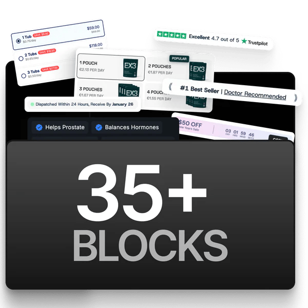 Blocks are smaller components that live inside sections. Elixir has **120+ of them**, and the product page is built almost entirely from blocks.
Rather than list every one, see the guide for the area you're building:
Title, price, variant pickers, tabs, FAQ, trust badges, guarantees, timers
Product page upsells, cart upsells, carousels, bundle offers
Gift progress bars, unlockable gift tiers, cart gift sections
Subscribe and save options, frequency choices, subscriber benefits
Headings, authors, callout quotes, listicle items, sticky buy bars
Progress bars, discount codes, payment icons, shipping protection
Blocks are smaller components that live inside sections. Elixir has **120+ of them**, and the product page is built almost entirely from blocks.
Rather than list every one, see the guide for the area you're building:
Title, price, variant pickers, tabs, FAQ, trust badges, guarantees, timers
Product page upsells, cart upsells, carousels, bundle offers
Gift progress bars, unlockable gift tiers, cart gift sections
Subscribe and save options, frequency choices, subscriber benefits
Headings, authors, callout quotes, listicle items, sticky buy bars
Progress bars, discount codes, payment icons, shipping protection