> ## Documentation Index
> Fetch the complete documentation index at: https://docs.ecomelixir.com/llms.txt
> Use this file to discover all available pages before exploring further.
# Set up your brand
> Configure colors, fonts, and buttons to match your brand identity
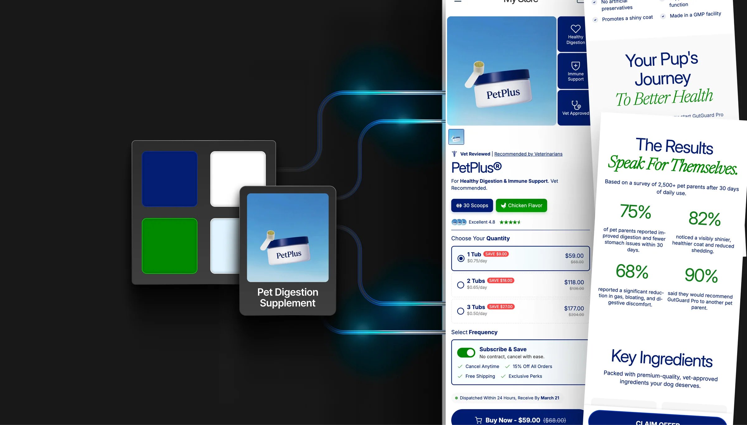 Everything in this guide is configured from **Theme settings** in the Shopify theme editor (the paintbrush icon in the left sidebar).
## Colors
Go to **Theme settings → Colors**.
Elixir runs on a **brand palette** of four swatches that feed the whole store. Set them once and your buttons, badges, accent text, and links all follow. There are no separate color schemes to manage.
### Brand colors
| Swatch | Where it shows up | Default |
| ------------- | --------------------------------------------------------------------------------- | --------- |
| **Primary** | Your main brand color: buttons, badges, accent text, progress bars, active states | `#EF4A65` |
| **Secondary** | Links and secondary accents | `#007BFF` |
| **Accent** | Highlights, and the second color of the accent text gradient | `#FFC107` |
| **Text** | Default heading and body text color across the store | `#111111` |
There's no background swatch. Sections are white by default. Change a background on the section itself using its **Section background** setting.
### Accent text gradient
Below the palette is a single **Accent Text Gradient** used everywhere gradient text appears (headings, review highlights, benefit titles, guarantee text).
It defaults to `linear-gradient(45deg, Primary, Accent)`, so it tracks your palette automatically. Change the Primary or Accent swatch and every gradient headline updates. Edit the gradient directly if you want a different angle or colors.
Sections that support it have a **Use accent gradient** toggle; turn it on to apply the gradient to that section's highlighted words.
### How the palette reaches your sections
* **Section color settings start on a palette color.** For example, a section's accent text color starts as your Primary. Change the swatch and everything still on its default follows.
* **Manually changing a color pins it.** Once you set a color on a section, that section keeps your value and stops following the palette. To reconnect it, paste the palette hex back in.
* **Sections added from a template or preset ship with their own colors** and won't follow the palette until you set them to your brand colors.
* **Sections with a "Use theme colors" toggle.** On means the section follows your palette. Off reveals the section's own background, text, accent, and button color settings.
Pick your palette **before** building pages. Restyling one swatch is instant; recoloring 20 sections you've already customized is not.
### Header and footer colors
Header and footer colors live on those sections, not in theme settings:
| Where | Setting |
| ------------------ | --------------------------------------------------------------------------------------- |
| **Header** section | Background color, text & icon color, menu hover/underline color, border colors |
| **Footer** section | Footer background, text, headings, links, menu items, dividers, newsletter block colors |
Most of these default to a palette color, so they follow your brand until you override them.
**Updating from an older Elixir version?** The old global color settings (Section background, Section text, Primary/Secondary accent, Button background/text, Header/Footer/Mobile menu background) have been replaced by the palette. Set your four brand swatches after updating, then check any section you had custom-colored.
## Typography
Go to **Theme settings → Typography**.
Elixir supports **three independent font families**:
| Font | Used for |
| ---------------- | ----------------------------------------------------- |
| **Heading font** | H1–H6 headings |
| **Body font** | Paragraphs, descriptions, UI text |
| **Accent font** | Decorative or brand-specific text (e.g. script fonts) |
Font weight is set by the font picker itself. Pick the weight you want when choosing each font.
### Key settings
* **Letter spacing.** Tighten or loosen character spacing, separately for headings, body, and accent text
* **Heading text transform.** Set all headings to uppercase, lowercase, or capitalize
* **Accent advanced settings.** Turn on to add text transform and italic style for the accent font
* **Custom font sizes.** Enable **Custom typography** to set exact pixel sizes for H1, H2, H3, body, and subtitle text
Enable **RTL support** in typography settings if your store serves Arabic, Hebrew, or other right-to-left languages.
## Buttons
Go to **Theme settings → Button Styling**.
Elixir has a **global button system**. Style your buttons once and it applies everywhere. Sections can override the global style if needed.
### Style options
* **Corner radius.** 0px (square) to 40px (pill-shaped), with an option to apply it to every button element or just primary buttons
* **Font size and letter spacing**
* **Vertical padding.** Controls button height
* **Text transform.** Uppercase, capitalize, and so on
* **Border width.** Outline thickness on buttons
### Colors and effects
* **Button color comes from your palette.** Buttons fill with your **Primary** brand color and use white labels. Change the Primary swatch to restyle every button at once. Individual sections can still override their own button colors.
* **3D effect.** Adds a bottom border to create a raised/3D look
* **Box shadow.** Adds depth with adjustable intensity (1–5)
* **Gradient buttons.** Replace the solid fill with a gradient: start/end colors, direction, separate hover colors, and an optional shine animation
* **Navigation and carousel buttons.** Turn on global nav button styling so slider arrows inherit the same radius, border, and shadow
## Layout
Go to **Theme settings → Layout**.
| Setting | What it does |
| ---------------------------- | ------------------------------------------------------------------ |
| **Page width** | Maximum content width (1000–1600px) |
| **Section padding** | Vertical and horizontal padding inside sections (desktop & mobile) |
| **Spacing between sections** | Gap between consecutive sections |
### Animations
Go to **Theme settings → Animations**.
| Setting | What it does |
| ----------------------------- | ---------------------------------------------------------------------------- |
| **Reveal sections on scroll** | Sections animate in as the customer scrolls |
| **Animation style** | Fade in, fade up, fade down, fade left, or fade right |
| **Duration** | 200–1000ms |
| **Distance** | How far the section travels (8–48px). Hidden when the style is plain fade in |
## Cards, inputs, and containers
Beyond colors and fonts, Elixir has global styling groups in **Theme settings** that apply store-wide. Each one controls border thickness, border opacity, corner radius, and shadow (opacity, offset, blur):
| Group | Applies to |
| ------------------------- | ---------------------------------------------------------------------------------------------------------------- |
| **Product cards** | Product cards in collections, carousels, and recommendations, plus card style, image padding, and text alignment |
| **Collection cards** | Collection tiles on the homepage and collection list pages |
| **Blog cards** | Article cards on the blog |
| **Content containers** | Text boxes and content blocks |
| **Media** | Images and videos |
| **Dropdowns and pop-ups** | Modals such as the size chart |
| **Drawers** | Cart drawer and menu drawer |
| **Inputs** | Form fields, search inputs, and quantity selectors |
| **Badges** | Sale and sold-out badge position and corner radius |
Keep corner radii consistent. Matching your button radius, card radius, and input radius is the fastest way to make a store look designed rather than assembled.
Everything in this guide is configured from **Theme settings** in the Shopify theme editor (the paintbrush icon in the left sidebar).
## Colors
Go to **Theme settings → Colors**.
Elixir runs on a **brand palette** of four swatches that feed the whole store. Set them once and your buttons, badges, accent text, and links all follow. There are no separate color schemes to manage.
### Brand colors
| Swatch | Where it shows up | Default |
| ------------- | --------------------------------------------------------------------------------- | --------- |
| **Primary** | Your main brand color: buttons, badges, accent text, progress bars, active states | `#EF4A65` |
| **Secondary** | Links and secondary accents | `#007BFF` |
| **Accent** | Highlights, and the second color of the accent text gradient | `#FFC107` |
| **Text** | Default heading and body text color across the store | `#111111` |
There's no background swatch. Sections are white by default. Change a background on the section itself using its **Section background** setting.
### Accent text gradient
Below the palette is a single **Accent Text Gradient** used everywhere gradient text appears (headings, review highlights, benefit titles, guarantee text).
It defaults to `linear-gradient(45deg, Primary, Accent)`, so it tracks your palette automatically. Change the Primary or Accent swatch and every gradient headline updates. Edit the gradient directly if you want a different angle or colors.
Sections that support it have a **Use accent gradient** toggle; turn it on to apply the gradient to that section's highlighted words.
### How the palette reaches your sections
* **Section color settings start on a palette color.** For example, a section's accent text color starts as your Primary. Change the swatch and everything still on its default follows.
* **Manually changing a color pins it.** Once you set a color on a section, that section keeps your value and stops following the palette. To reconnect it, paste the palette hex back in.
* **Sections added from a template or preset ship with their own colors** and won't follow the palette until you set them to your brand colors.
* **Sections with a "Use theme colors" toggle.** On means the section follows your palette. Off reveals the section's own background, text, accent, and button color settings.
Pick your palette **before** building pages. Restyling one swatch is instant; recoloring 20 sections you've already customized is not.
### Header and footer colors
Header and footer colors live on those sections, not in theme settings:
| Where | Setting |
| ------------------ | --------------------------------------------------------------------------------------- |
| **Header** section | Background color, text & icon color, menu hover/underline color, border colors |
| **Footer** section | Footer background, text, headings, links, menu items, dividers, newsletter block colors |
Most of these default to a palette color, so they follow your brand until you override them.
**Updating from an older Elixir version?** The old global color settings (Section background, Section text, Primary/Secondary accent, Button background/text, Header/Footer/Mobile menu background) have been replaced by the palette. Set your four brand swatches after updating, then check any section you had custom-colored.
## Typography
Go to **Theme settings → Typography**.
Elixir supports **three independent font families**:
| Font | Used for |
| ---------------- | ----------------------------------------------------- |
| **Heading font** | H1–H6 headings |
| **Body font** | Paragraphs, descriptions, UI text |
| **Accent font** | Decorative or brand-specific text (e.g. script fonts) |
Font weight is set by the font picker itself. Pick the weight you want when choosing each font.
### Key settings
* **Letter spacing.** Tighten or loosen character spacing, separately for headings, body, and accent text
* **Heading text transform.** Set all headings to uppercase, lowercase, or capitalize
* **Accent advanced settings.** Turn on to add text transform and italic style for the accent font
* **Custom font sizes.** Enable **Custom typography** to set exact pixel sizes for H1, H2, H3, body, and subtitle text
Enable **RTL support** in typography settings if your store serves Arabic, Hebrew, or other right-to-left languages.
## Buttons
Go to **Theme settings → Button Styling**.
Elixir has a **global button system**. Style your buttons once and it applies everywhere. Sections can override the global style if needed.
### Style options
* **Corner radius.** 0px (square) to 40px (pill-shaped), with an option to apply it to every button element or just primary buttons
* **Font size and letter spacing**
* **Vertical padding.** Controls button height
* **Text transform.** Uppercase, capitalize, and so on
* **Border width.** Outline thickness on buttons
### Colors and effects
* **Button color comes from your palette.** Buttons fill with your **Primary** brand color and use white labels. Change the Primary swatch to restyle every button at once. Individual sections can still override their own button colors.
* **3D effect.** Adds a bottom border to create a raised/3D look
* **Box shadow.** Adds depth with adjustable intensity (1–5)
* **Gradient buttons.** Replace the solid fill with a gradient: start/end colors, direction, separate hover colors, and an optional shine animation
* **Navigation and carousel buttons.** Turn on global nav button styling so slider arrows inherit the same radius, border, and shadow
## Layout
Go to **Theme settings → Layout**.
| Setting | What it does |
| ---------------------------- | ------------------------------------------------------------------ |
| **Page width** | Maximum content width (1000–1600px) |
| **Section padding** | Vertical and horizontal padding inside sections (desktop & mobile) |
| **Spacing between sections** | Gap between consecutive sections |
### Animations
Go to **Theme settings → Animations**.
| Setting | What it does |
| ----------------------------- | ---------------------------------------------------------------------------- |
| **Reveal sections on scroll** | Sections animate in as the customer scrolls |
| **Animation style** | Fade in, fade up, fade down, fade left, or fade right |
| **Duration** | 200–1000ms |
| **Distance** | How far the section travels (8–48px). Hidden when the style is plain fade in |
## Cards, inputs, and containers
Beyond colors and fonts, Elixir has global styling groups in **Theme settings** that apply store-wide. Each one controls border thickness, border opacity, corner radius, and shadow (opacity, offset, blur):
| Group | Applies to |
| ------------------------- | ---------------------------------------------------------------------------------------------------------------- |
| **Product cards** | Product cards in collections, carousels, and recommendations, plus card style, image padding, and text alignment |
| **Collection cards** | Collection tiles on the homepage and collection list pages |
| **Blog cards** | Article cards on the blog |
| **Content containers** | Text boxes and content blocks |
| **Media** | Images and videos |
| **Dropdowns and pop-ups** | Modals such as the size chart |
| **Drawers** | Cart drawer and menu drawer |
| **Inputs** | Form fields, search inputs, and quantity selectors |
| **Badges** | Sale and sold-out badge position and corner radius |
Keep corner radii consistent. Matching your button radius, card radius, and input radius is the fastest way to make a store look designed rather than assembled.